 Web Maker
Web Maker offers 6 layout options so you can arrange the code panes and preview in a way that works best for your task. You can switch layouts using the layout buttons in the bottom toolbar.
Available layouts #
Layout 1 — Preview on right #
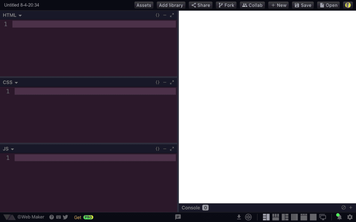
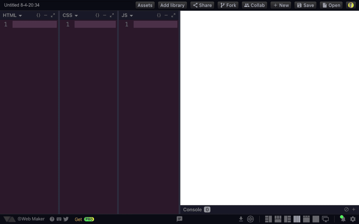
The code panes (HTML, CSS, JS) are stacked vertically on the left, with the preview on the right. This is a good default for wide screens.
Layout 2 — Preview on bottom #
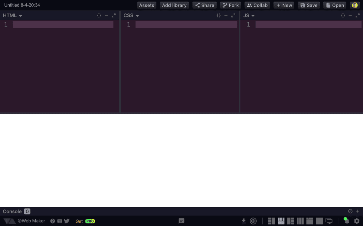
The code panes are arranged side by side horizontally at the top, with the preview below. This is the default layout on small screens.
Layout 3 — Preview on left #
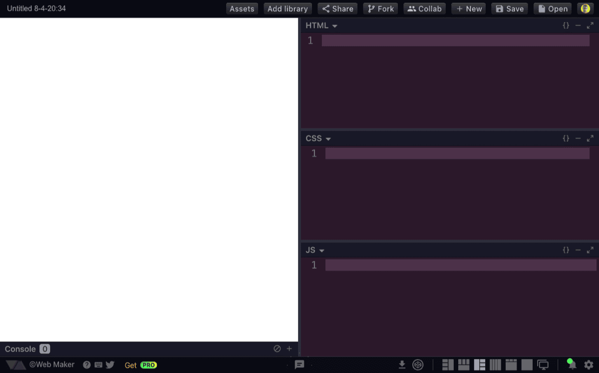
Same as Layout 1 but mirrored — the preview is on the left and code panes are on the right.
Layout 4 — Full screen preview #
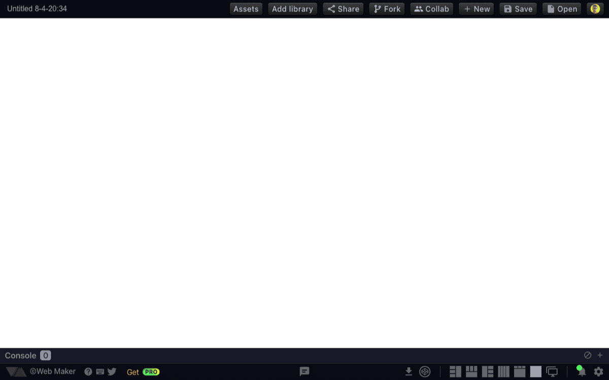
Hides all code panes and shows only the preview at full width. Useful for viewing the output without distraction.
Layout 5 — All vertical panes #
All three code panes are arranged horizontally in a row, with the preview below. The default split gives 75% to the code area and 25% to the preview.
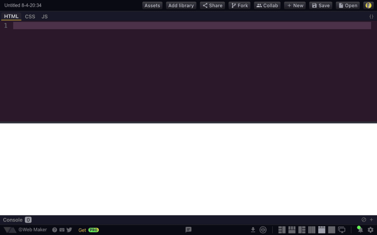
Layout 6 — Tabbed code panes #
The HTML, CSS, and JS panes are combined into a single tabbed editor, similar to file tabs in a regular code editor. Click a tab (HTML, CSS, JS) to switch between languages, with only the active one visible at a time. This maximizes the editing area for the current language and is great for focused work or smaller screens, while keeping the preview alongside.
Switching layouts #
Click any layout button in the bottom toolbar to switch. Clicking the currently active layout toggles it back to Layout 2 (preview on bottom).
The layout setting is saved per creation, so each of your creations can use a different layout.
Tip: You can also pre-select a layout when opening Web Maker by passing the
layoutURL parameter (e.g.?layout=4). See Layout in URL parameters for the full list of accepted values.
Responsive behavior #
On screens narrower than 600px, Web Maker automatically switches to Layout 2 (preview on bottom) for the best mobile experience.
Collapsing panes #
In any layout, you can maximize a single code pane by double-clicking its header bar, which collapses the other two panes. Double-click again to restore equal sizes.